
The above video walks through the Data Dashboard and where that data is derived from.
The dashboard can be reached at http://admin.penjiapp.com, where each community has its own. The Data Dashboard is a collection of charts and tools to visualize your data. It is a growing set of reports with adjustable filters that are viewed in real-time (rather than configuring and exporting to PDF). The following tabs and information are included in the Dashboard:
Overview
The Overview tab, shown above, provides information on key indicators broken down by daily, weekly, and annual metrics. You can also see a historical chart of interactions and daily operations, both broken down by mode.
NOTE: In the charts for Appointment Sessions, Group Sessions, and Drop-in Sessions, if the granularity is set to "Weekly," each data point will show the number of sessions that took place over the course of 7 days, starting from the date given when hovering over the data point.
Visits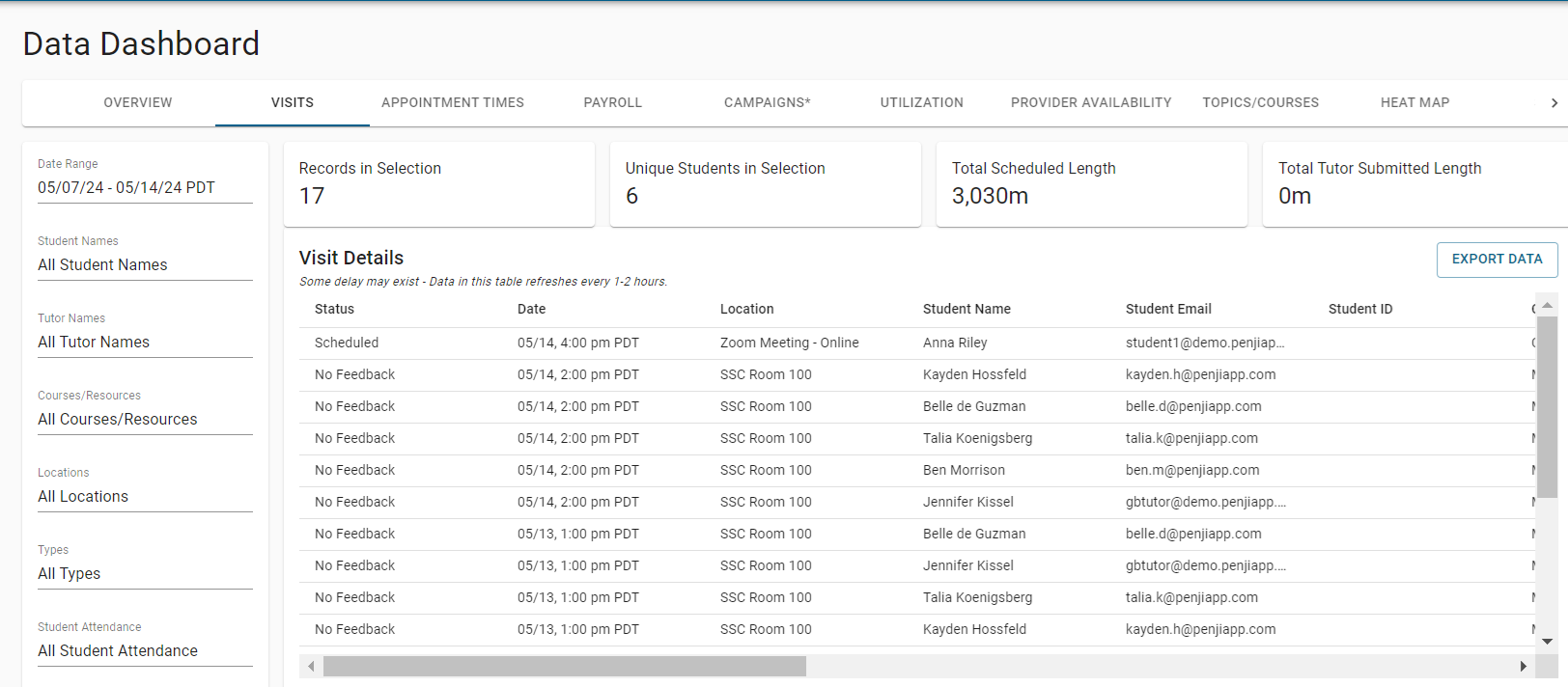
The Visits Dashboard is used to explore visits by student, provider, topic (course), mode, location, and other filters within a specific date range. Your filtered view can be exported to CSV format and viewed in Excel.
Payroll
The Payroll Dashboard is where Penji tallies a provider's hours across the different modes for a select date range. The provider payroll table is further discussed here: Admins: Provider Payroll Table.
Posts
The Campaigns Dashboard serves as a hub for analyzing the effectiveness and engagement of your communication strategies through Penji Pathways.
Utilization
The Utilization Dashboard helps you see how effectively educational resources are being used and how engaged students are with learning activities. This dashboard helps you analyze key metrics and trends, which helps optimize resource utilization, enhance student engagement, and drive operational efficiency.
Provider Availability
The Provider Availability Dashboard gives admins insights into the scheduling and availability of providers within your community.
Topics/Courses
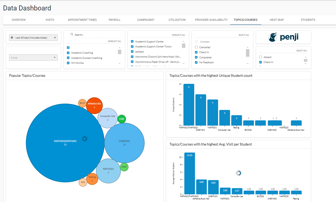
The Topics Dashboard allows admins to analyze for a specific date range and set of topics the percentage booked. It also shows popular topics for sessions and drop-in visits. Your filtered view for the percentage booked can be exported to CSV format and viewed in Excel.
Heat Map

The Heat Map Dashboard provides a visually intuitive representation of appointment distribution across different dimensions (such as appointment frequency, location distribution, student engagement, and course popularity), letting admins identify patterns, trends, and areas of focus within their scheduling and service delivery processes.
Students
The Student Dashboard provides a comprehensive overview of student engagement and participation within your community. Specifically, this sums each unique students total hours and visits during the time period. There is also a table that shows students who have had an absence, and how many, during the period.
Comments
0 comments
Please sign in to leave a comment.